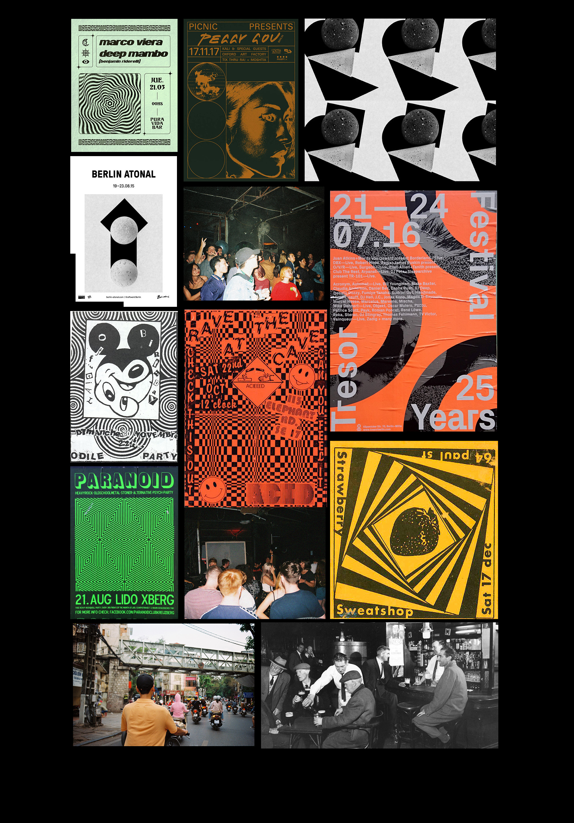
My visual research led me to develop a style that combined an acid-house sensibility with universally recognisable tropes and the more structured/grid-based approach of European techno club posters. During this initial process I gathered images taken by crew members during events, vintage photographs of Ireland, and my own 35mm photos.

Photography Style Guide:
Analogue photography that features noticeable film grain and harsh flash is preferred. A gritty polaroid aesthetic is sought for its immediacy and unvarnished nature. For the website, shots taken from live events, with an emphasis on people and action, invite the viewer into the party and set the scene.
(Photo by Deckie / Qwerk - taken from Sweet Tooth FB page)

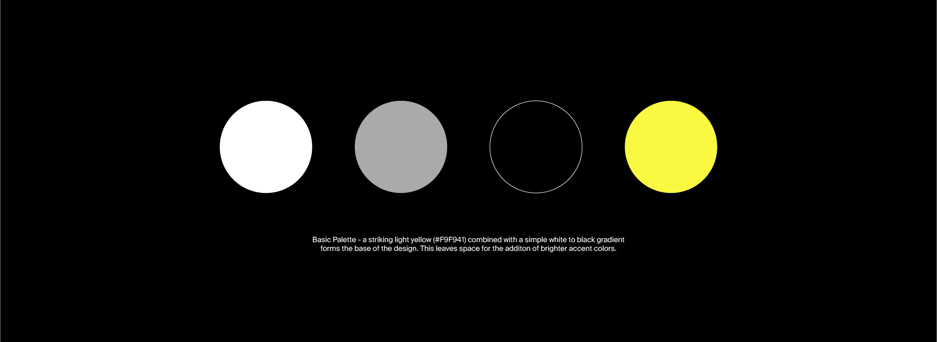
Typography and colour palette.

Sketchbook iterations.
Original Logo.
First Redesign.
Final Logo focuses on a simplified curve in the shape of a smile and type.
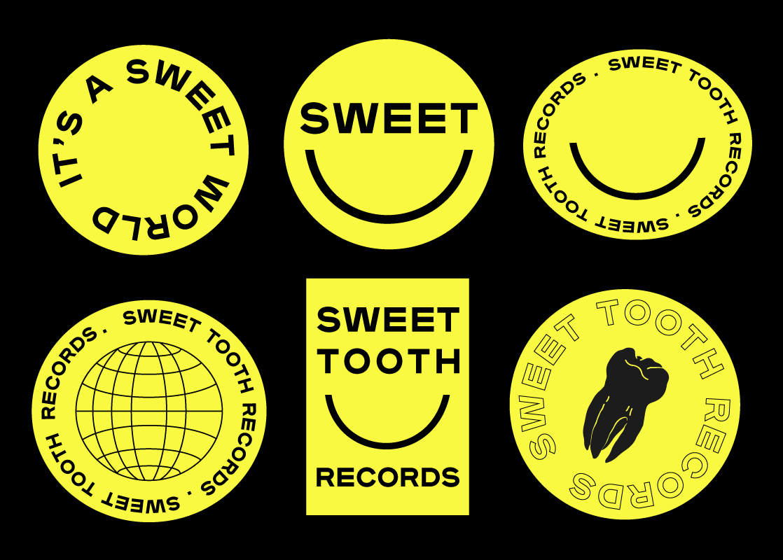
Logo drafts - used to create a sticker pack and throughout merch.
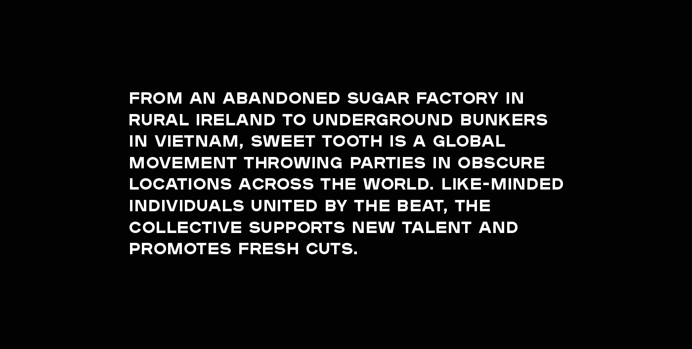
Care and attention was given to developing the label's voice in conjunction with its visuals.
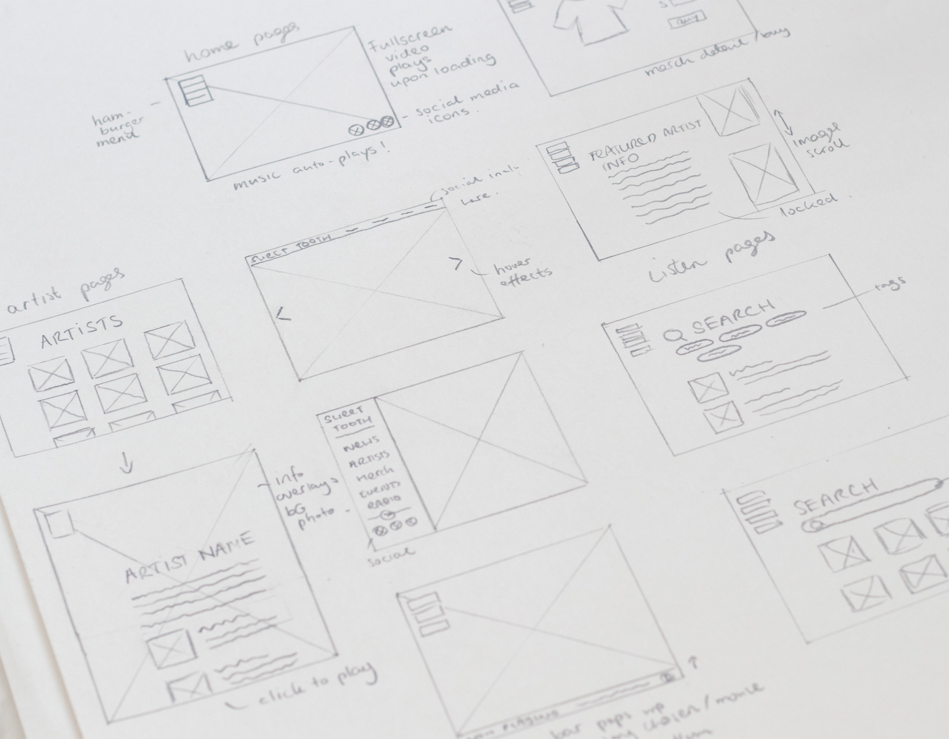 Layout sketches for website.
Simple wireframe prototype developed using Figma/ Illustrator.